
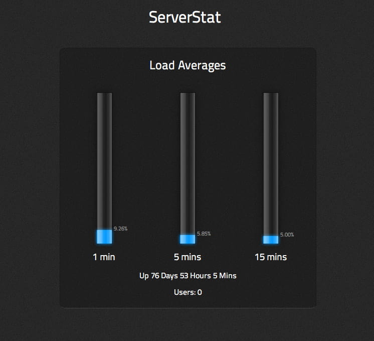
Recently I have been reading about some of the amazing things developers have been doing with html5 and css3, so I decided to see what I could do myself. Above is a screecap from safari of a little conpcept status monitor for my server, the actual content is not massively useful, it's just some info from the 'top' command showing load averages. It's useful data to work with in this case though as it's a percentage, which can be put into pretty bar form.
I initially mocked up the design in Photoshop, and when building, found that the layer styles I used to apply the 3d shine, shadow and glow effects could be translated almost directly into css3 equivalents. There is only one actual image file used to create this and that is for the noise effect on the background, everything else is css - drop shadows, gradients, border-radius and good use of RGBA color.
The most interesting bit for me was the gloss effect and how to apply it in a flexible way, the solution was the follwing css class:
div.shiney:after{ content: -webkit-gradient(
	linear, 0% 0%, 100% 0%,
	from(rgba(255,255,255,0.0)),
	to(rgba(255,255,255,0.48)),
	color-stop(8%, rgba(255,255,255,0.51)),
	color-stop(37%, rgba(255,255,255,0.25)),
	color-stop(41%, rgba(255,255,255,0.09)),
	color-stop(60%, rgba(255,255,255,0.0)),
	color-stop(61%, rgba(255,255,255,0.0)),
	color-stop(74%, rgba(255,255,255,0.13)),
	color-stop(78%, rgba(255,255,255,0.1))
);
opacity:0.6 }
This way I could simply add the 'shiney' class to any div and the shine would be applied over the top of actual contents.